myBeepr Design System
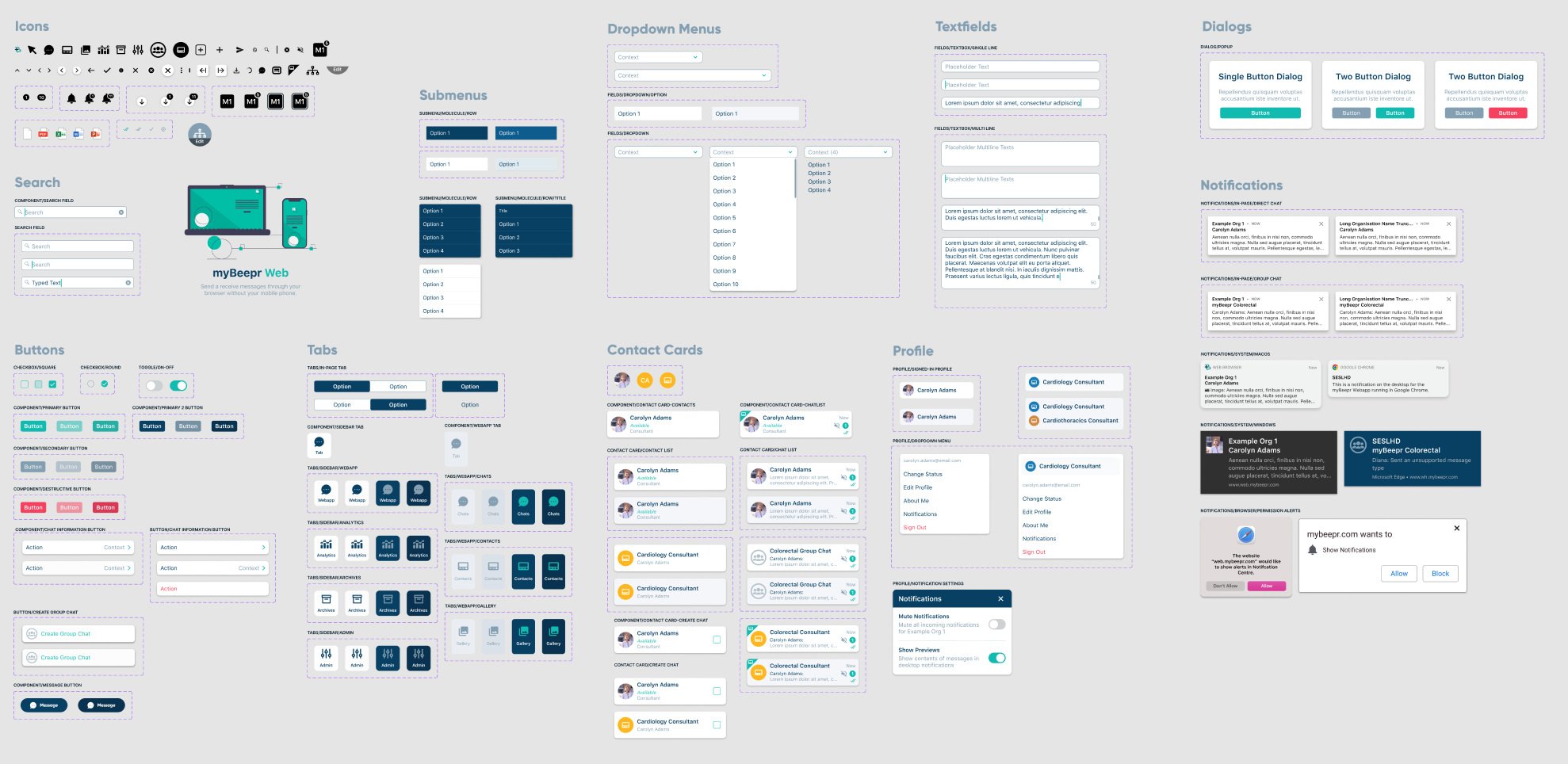
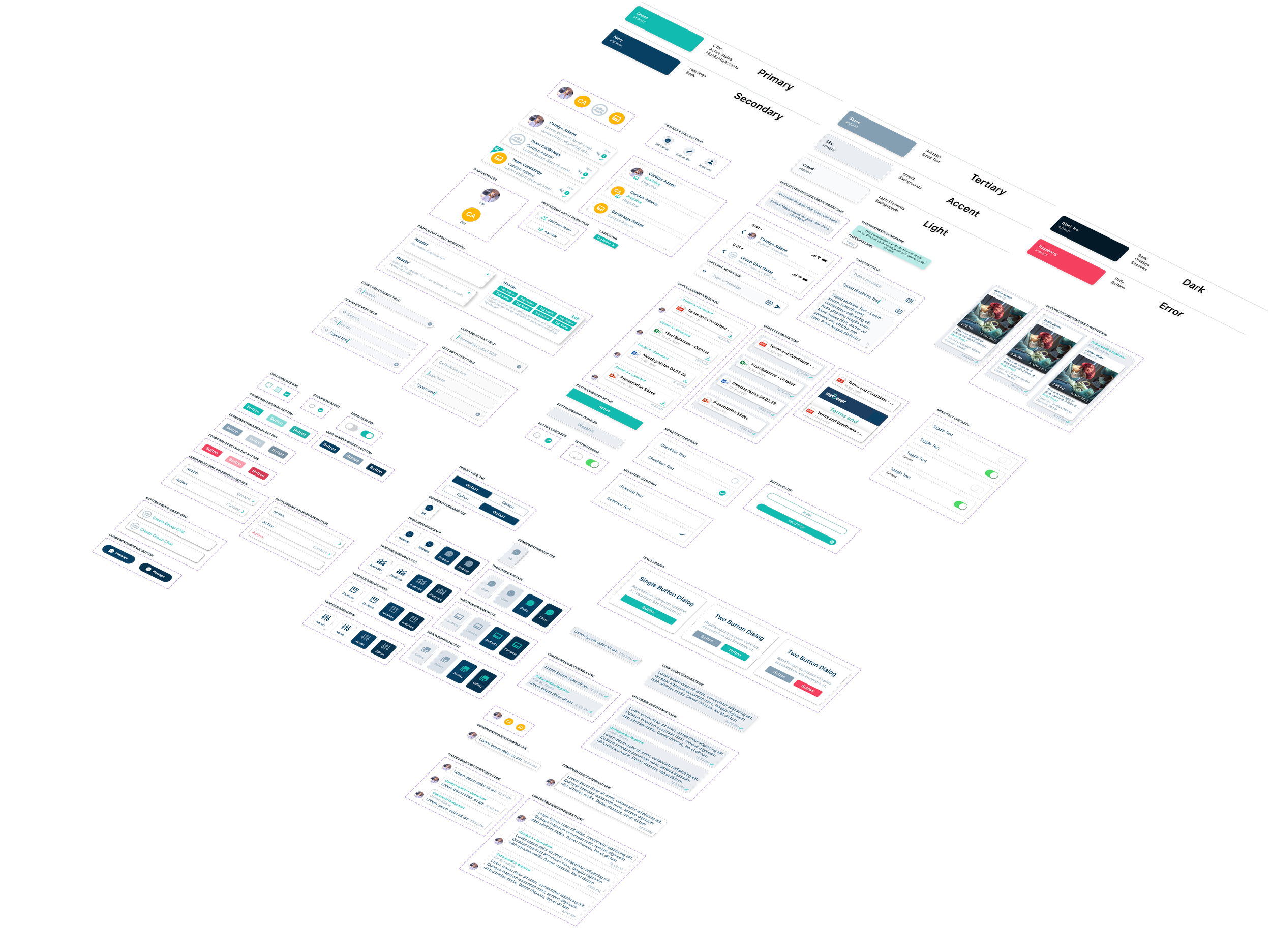
Following the release of the XAM-based Mobile App as well as the companion WebApp, our design process and method of communication to developers and other teams needed to change. This project showcases the creation of the myBeepr Design System, built for Mobile, Web and Marketing design guideline communication.
Following it’s first iteration and release, the implementation of the design system enabled both designers and developers access to a constantly evolving and living design document - outlining colours, text styles, symbols and components.
My Role
Day-to-day designer and mentor to design team of 2
Developed and maintained design systems across 3 different platforms (Mobile, Web, Marketing)
Developer collaboration to ensure correct hand-off practices and naming patterns
Date
Feb 2023 - Present

The Goal
Switching from Sketch to Figma as our primary design software allowed the design team to work collaboratively, in addition to extending further design communication opportunities to other teams.
With a development team growing twice as larger within a year, we needed a better solution to not only align design elements between designers, but also between designers, developers and QA testers.
Up until June 2023, the current design to development to QA delivery process looked like this
In this version of design delivery, the designer is the source of truth, who publishes designs to Zeplin from which developers and QA testers reference from. This creates issues when designs get updated, creating multiple versions of the same component or updating components without other designs continuing to be consistent.
The proposed solution incorporates the design system, maintained in Figma; allowing designers, developers and QA testers to all reference from the same living design document

Atomic Components

Molecule Components
Scaling the Design System
Taking the Atomic Design approach, each existing component is broken down into their atomic base components; typography, styles, spacing, colours and icons.
By taking this approach, each molecule component that is used in an existing design is linked to an array of atomic components, each of which may be updated and once published in the design system, are updated wherever they are used across Figma. This ensures consistency within the design team, with a flow on effect to help ensure consistency across developers and QA testers.
Additionally, by maintaining the design system and documenting any changes, when published, each release is communicated clearly to all teams using the design system.


